Use Native Layout Features In Your Modules
This guide follows on Create a Custom Portal Module, where you created a landing page module. You will learn how to add native sidebar dropdown element, action buttons and search, a split view window, and layout options using the built-in functions of Directus. These help provide a more coherent experience from other Directus modules and collections.
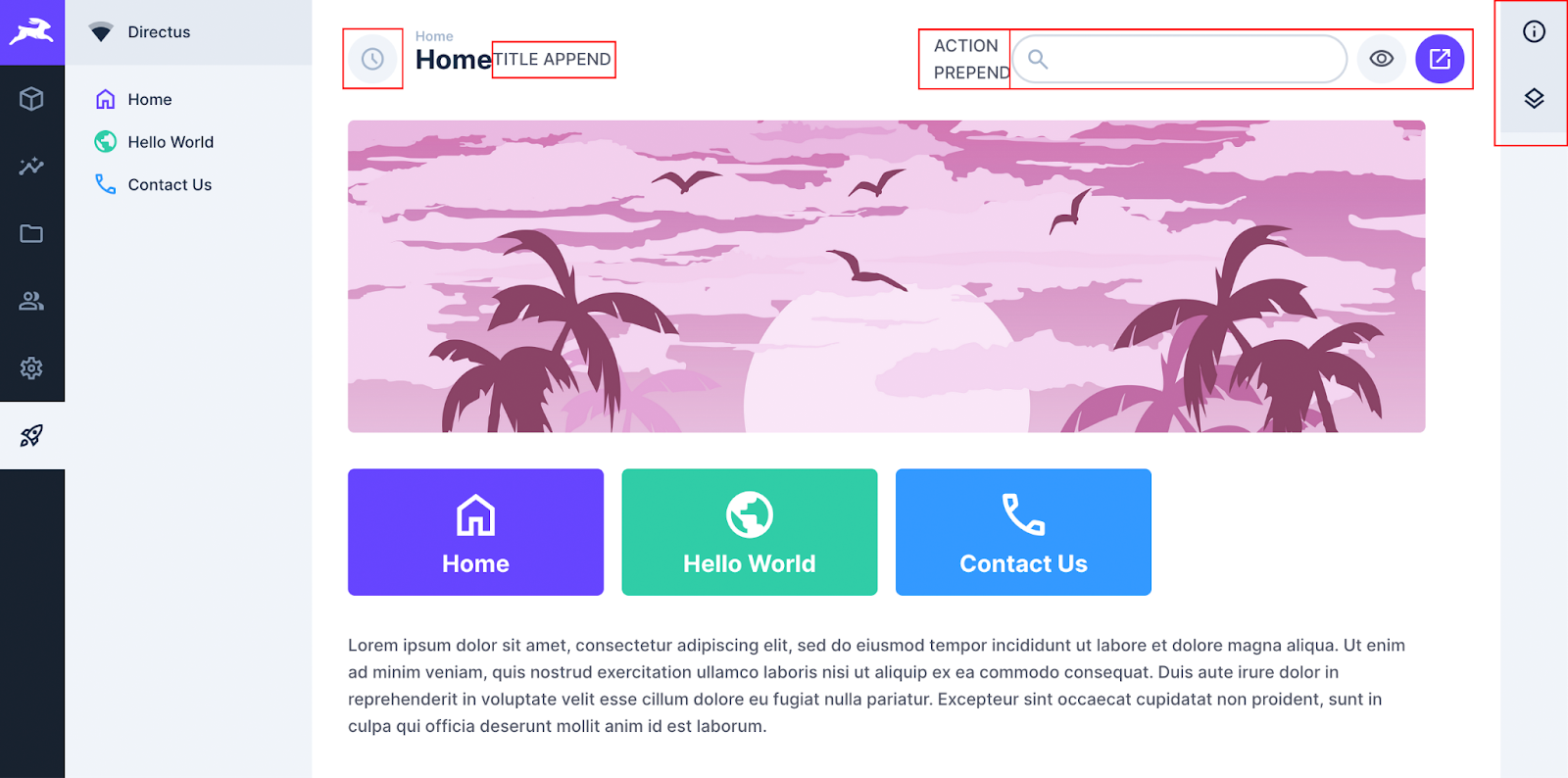
Available Slots
The private view in Directus has a number of slots available which are empty by default but you can add content using a template tag. For example:
<template #slot_name>
	// Content to insert into the slot
</template><template #slot_name>
// Content to insert into the slot
</template>The slots available to you in this view are:
headlinetitle-outer:prependtitle-outer:appendactionsactions:prependsidebarsplitView
headline
This is the area above the page title utilized for the breadcrumbs. Use the following code to include a breadcrumb.
<template v-if="breadcrumb" #headline>
	<v-breadcrumb :items="breadcrumb" />
</template><template v-if="breadcrumb" #headline>
<v-breadcrumb :items="breadcrumb" />
</template>v-breadcumb accepts a list of objects which will output the pages in order of the list:
[
	{
		name: 'Home',
		to: '/landing-page',
	},
]
[
{
name: 'Home',
to: '/landing-page',
},
]
title-outer:prepend
You can add content to the left of the title using the Title Outer Prepend slot, which Directus uses this slot for an icon inside a circle. The icon relates to the current page such as the collection icon or the cog icon for settings.
<template #title-outer:prepend>
	<v-button class="header-icon" rounded disabled icon secondary>
		<v-icon name="access_time" />
	</v-button>
</template><template #title-outer:prepend>
<v-button class="header-icon" rounded disabled icon secondary>
<v-icon name="access_time" />
</v-button>
</template>
Styling Icon
The icon is rounded, disabled and secondary. This will keep the same look as the rest of Directus but you can remove these to customize the look and feel.
title-outer:append
You can add content or clickable buttons to the right of the title which is normally used for version control and bookmarks. In this example, the slot is used for a clickable icon button.
<template #title-outer:append>
	<v-icon
		clickable
		name="add_circle"
		@click="buttonAction()"
	/>
</template><template #title-outer:append>
<v-icon
clickable
name="add_circle"
@click="buttonAction()"
/>
</template>
Adding Logic
Any functions for button click actions will need to be included in the setup and returned to the template.
actions
This slot is located in the header on the right-hand side. You can add content to this area such as clickable buttons and a search bar.
<template #actions>
	<v-input class="module-search" :model-value="search">
		<template #prepend><v-icon name="search" /></template>
	</v-input>
	<v-button v-tooltip.bottom="'COOL'" icon rounded>
		<v-icon name="launch" />
	</v-button>
</template><template #actions>
<v-input class="module-search" :model-value="search">
<template #prepend><v-icon name="search" /></template>
</v-input>
<v-button v-tooltip.bottom="'COOL'" icon rounded>
<v-icon name="launch" />
</v-button>
</template>You will also need to style the search. I suggest matching the existing one in Directus using this CSS:
.v-input.full-width.module-search {
    display: flex;
    width: 300px;
    height: 44px;

    .input {
        width: auto;
        padding: 0 10px;
        overflow: hidden;
        color: var(--theme--foreground);
        text-overflow: ellipsis;
        background-color: var(--theme--background);
        border-radius: 22px;
    }
}
.v-input.full-width.module-search {
display: flex;
width: 300px;
height: 44px;
.input {
width: auto;
padding: 0 10px;
overflow: hidden;
color: var(--theme--foreground);
text-overflow: ellipsis;
background-color: var(--theme--background);
border-radius: 22px;
}
}
Adding Logic
Include functions for the search and any action buttons in your setup and return them to the template.
actions:prepend
You can add content before the actions slot like page information and selection details but this requires your own CSS to ensure it outputs on a single line.
<template #actions:prepend>
	ACTION PREPEND
</template><template #actions:prepend>
ACTION PREPEND
</template>
Limits
This space is quite limited due to the length of the page title and the amount of actions.
sidebar
By default, your sidebar is empty but still present. It’s worth making use of this real estate with various tasks or information that users have grown to expect in the right side menu.
In the example below are two dropdown sections using the sidebar-detail component. The first section is the Information section that is used throughout Directus. You can create a page_description variable to output information related to the current page, then update this content within your setup whenever a new page is selected. The second section outputs some custom text.
<template #sidebar>
    <sidebar-detail icon="info" title="Information" close>
        <div v-md="page_description" class="page-description" />
    </sidebar-detail>
    <sidebar-detail icon="layers" title="SIDEBAR ITEM">
        SIDEBAR ITEM CONTENT
    </sidebar-detail>
</template><template #sidebar>
<sidebar-detail icon="info" title="Information" close>
<div v-md="page_description" class="page-description" />
</sidebar-detail>
<sidebar-detail icon="layers" title="SIDEBAR ITEM">
SIDEBAR ITEM CONTENT
</sidebar-detail>
</template>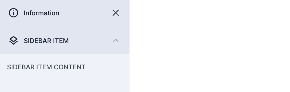
Close Attribute
The close attribute on the first sidebar-detail component changes the chevron icon to a close button and when clicked, the sidebar collapses. This is highly recommended for usability.
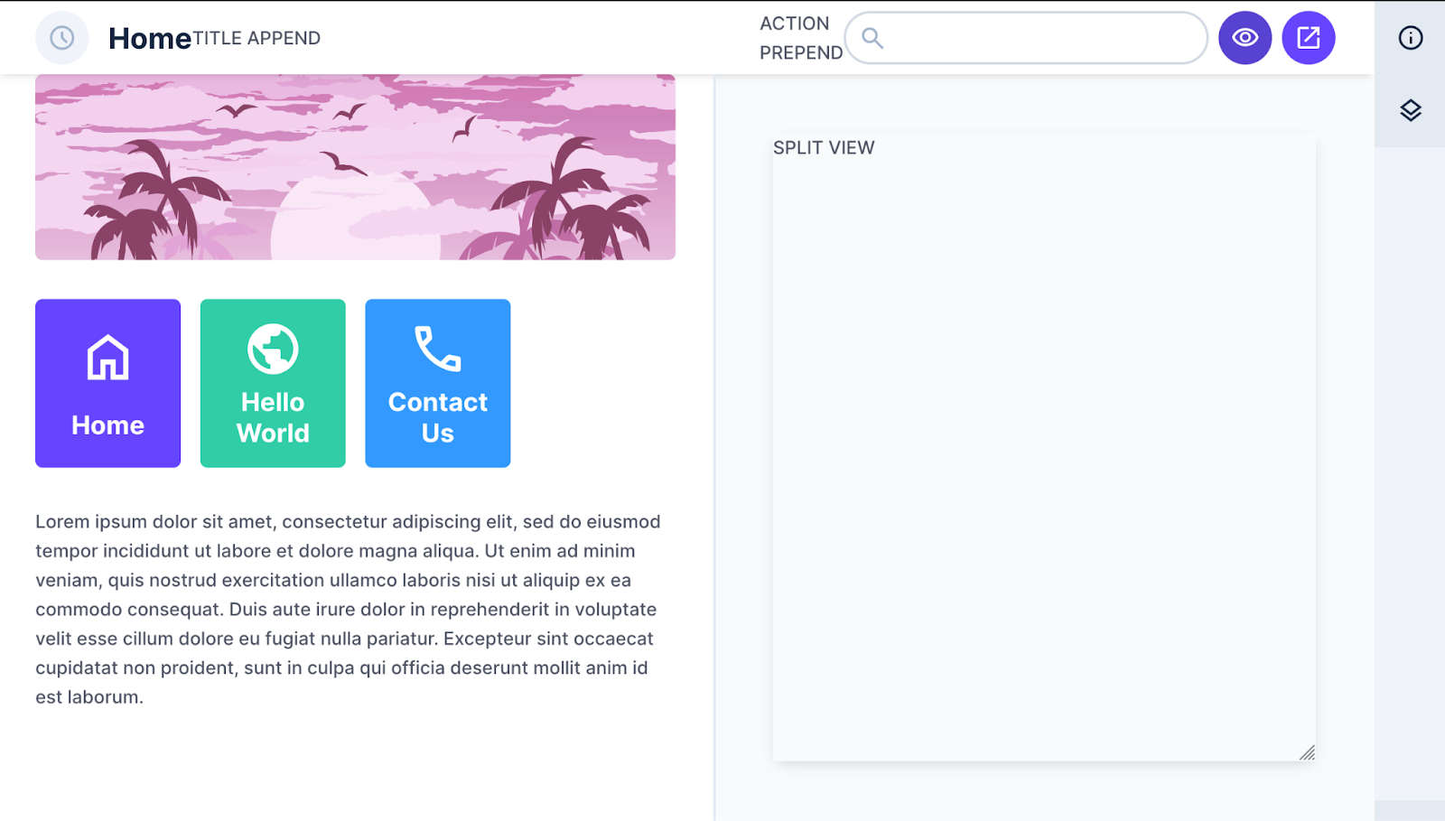
splitView
You can add your own content to the split view slot which normally handles the Live Preview feature of Directus. It relies on the value "split" to be dynamically added to the private-view's v-model. This is normally controlled by an action button as shown below but can be triggered any way you choose. To use this feature, you need to add some attributes to the parent private-view and create a toggle button. The actions slot is a convenient place:
<private-view :splitView="livePreviewMode" :split-view-min-width="310" :title="page_title">
	<template #actions>
		<v-button
			v-tooltip.bottom="!livePreviewMode ? 'Enable Split View' : 'Disable Split View'"
			rounded
			icon
			class="action-preview"
			:secondary="!livePreviewMode"
			@click="toggleSplitView"
		>
			<v-icon name="visibility" outline />
		</v-button>
	</template>


	<template #splitView>
		<div ref="livePreviewEl" class="live-preview">
			<div class="container">
				<div class="iframe-view">
					<div
						ref="resizeHandle"
						class="resize-handle"
						:style="{
							width: '100%',
							height: '100%',
							resize: 'both',
						}"
					>
						<!-- <iframe id="frame" ref="frameEl" :src="url" @load="onIframeLoad" /> -->
						SPLIT VIEW
					</div>
				</div>
			</div>
		</div>
	</template>
</private-view><private-view :splitView="livePreviewMode" :split-view-min-width="310" :title="page_title">
<template #actions>
<v-button
v-tooltip.bottom="!livePreviewMode ? 'Enable Split View' : 'Disable Split View'"
rounded
icon
class="action-preview"
:secondary="!livePreviewMode"
@click="toggleSplitView"
>
<v-icon name="visibility" outline />
</v-button>
</template>
<template #splitView>
<div ref="livePreviewEl" class="live-preview">
<div class="container">
<div class="iframe-view">
<div
ref="resizeHandle"
class="resize-handle"
:style="{
width: '100%',
height: '100%',
resize: 'both',
}"
>
<!-- <iframe id="frame" ref="frameEl" :src="url" @load="onIframeLoad" /> -->
SPLIT VIEW
</div>
</div>
</div>
</div>
</template>
</private-view>In this example, livePreviewMode is toggled between true and false which can be achieved using the following code inside your setup:
const livePreviewMode = ref(false);

function toggleSplitView() {
	livePreviewMode.value = !livePreviewMode.value;
}

return { ..., toggleSplitView, livePreviewMode };
const livePreviewMode = ref(false);
function toggleSplitView() {
livePreviewMode.value = !livePreviewMode.value;
}
return { ..., toggleSplitView, livePreviewMode };Add the following CSS to your style for the default styling of the SplitView container.
.live-preview {
	width: 100%;
	height: 100%;
	.container {
		width: 100%;
		height: calc(100% - 44px);
		overflow: auto;
	}
	.iframe-view {
		width: 100%;
		height: 100%;
		overflow: auto;
		display: grid;
		padding: 48px;
		#frame {
			width: 100%;
			height: 100%;
			border: 0;
		}
		.resize-handle {
			overflow: hidden;
			box-shadow: 0px 4px 12px -4px rgba(0, 0, 0, 0.2);
		}
	}
}
.live-preview {
width: 100%;
height: 100%;
.container {
width: 100%;
height: calc(100% - 44px);
overflow: auto;
}
.iframe-view {
width: 100%;
height: 100%;
overflow: auto;
display: grid;
padding: 48px;
#frame {
width: 100%;
height: 100%;
border: 0;
}
.resize-handle {
overflow: hidden;
box-shadow: 0px 4px 12px -4px rgba(0, 0, 0, 0.2);
}
}
}This outputs an eye button in the actions slot. When clicked, the SplitView container slides in from the right. Clicking the button again slides the container out to the right.
Permissions
Modules don’t have access control like collections do but you can use the permissions of a collection or the admin rights to limit access to content or the entire module.
To start using permissions, make sure to import useStores from the extensions SDK:
import { useApi, useStores } from '@directus/extensions-sdk';

// At the top of setup():
const { usePermissionsStore } = useStores();
const { hasPermission } = usePermissionsStore();
const permission = hasPermission('page', 'read');

// At the bottom of setup():
return { ..., permission };
import { useApi, useStores } from '@directus/extensions-sdk';
// At the top of setup():
const { usePermissionsStore } = useStores();
const { hasPermission } = usePermissionsStore();
const permission = hasPermission('page', 'read');
// At the bottom of setup():
return { ..., permission };Is permission is true, the user has access. In the template, you can add a new view and the v-info component for when the permission constant is false:
<private-view v-if="!permission" title="401: Unauthorized">
	<v-info icon="block" title="Unauthorized Access" type="danger">
		You do not have permission to access this page
	</v-info>
</private-view>

<private-view v-else :title="page_title">
	// Existing Content
</private-view><private-view v-if="!permission" title="401: Unauthorized">
<v-info icon="block" title="Unauthorized Access" type="danger">
You do not have permission to access this page
</v-info>
</private-view>
<private-view v-else :title="page_title">
// Existing Content
</private-view>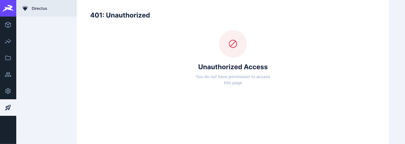
Other Slots
The navigation, actions, and sidebar slots have not been rendered because it’s using a separate private-view. Consider using the permissions variable to also prevent the related functions from running as well. This will improve the performance of your application.
You can also create multiple variables that check permissions in different collections or access levels such as create, read, update, and delete. You could use those variables to hide or show various sections in your view using v-if. This works well when you use a collection to feed the content of your module.
Summary
With this guide, you have learned how to expand your module to utilize the various slots available in the private view and restrict your module using the permissions store. Utilizing the built-in components will provide a consistent experience for users when moving into your module and ultimately improve usability.