Custom Theming
The Directus Data Studio has been developed with customization and extensibility in mind. Colors and styles referenced within the codebase are based around theme rules which makes it easy to make comprehensive styling changes to the Data Studio.
Theming options can be found in dedicated section in the Settings Module.
Branding
The branding section contains global settings that are applied as defaults throughout the Data Studio and favicon.
- Project Color — Sets color on the project logo, favicon and login/public pages.
- Project Logo — Adds a 40x40px logo at the top of the Module Bar and on the login/public pages. The image is inset within a 64x64px square filled with the project color. We recommend using a PNG file for optimal compatibility.
- Public Foreground — Adds image on the public page's right-pane (max-width 400px).
- Public Background — Adds image displayed behind the public foreground image, shown full-bleed within the public page's right-pane. When a public background image is not set, the project color is used instead.
- Public Favicon — Adds favicon for the app.
- Public Note — A helpful note displayed at the bottom of the public page's right-pane, supports markdown for rich-text formatting.
- Default Appearance — Light or Dark theme (or based on system preference).
Theming Defaults
The Directus Theming Engine contains two customizable themes - Light Theme and Dark Theme. If default values are changed, they will be automatically mapped to the correct elements in the Data Studio, even between upgrades.
Both themes can be updated for all users (in the Settings Module), or for specific users (in the Users Module).
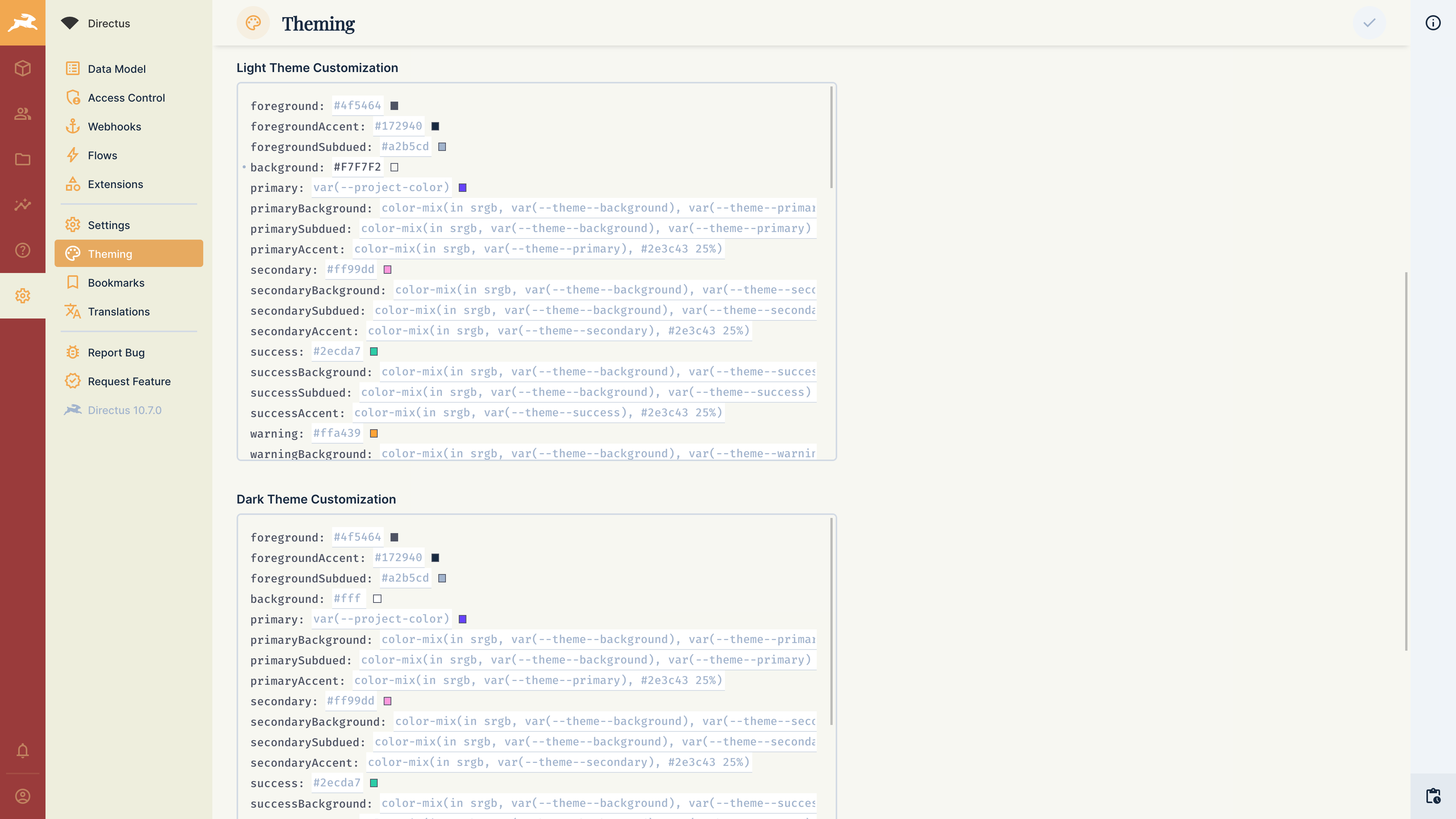
Any valid CSS values will be accepted by the Directus Theming Engine. The raw JSON values containing your changes can be seen by clicking the dropdown next to the theme customization labels. These can be saved and easily applied between projects or users.
Custom CSS
The Custom CSS input allows you to override the Data Studio's default styling. Be aware that the Data Studio's core code, and therefore its DOM selectors, may change in any release. These updates are not considered a breaking change.
Example
You may wish to remove UI elements from the Data Studio based on your use case. You can remove the notifications button by adding the following Custom CSS:
.v-button.notifications {
  display: none;
}
.v-button.notifications {
display: none;
}Since App styles are inserted/removed whenever a component is rendered, you'll need to be aware of CSS priority. Using :root or body likely isn't scoped enough, you'll need to define a more specific scope, such as #app, or use !important.
body {
	--family-sans-serif: 'Comic Sans MS';
	--primary: MediumSlateBlue !important;
}
body {
--family-sans-serif: 'Comic Sans MS';
--primary: MediumSlateBlue !important;
}This example is better served using the Theming Engine, but is a good example of Directus' flexibility of approach.
Action Styling
The --primary variable (and its shades) control call-to-actions and all other elements within the App using the "Directus Purple". While it may be tempting to override this variable with your brand's color, please first review the following warnings:
- Avoid using yellow, orange, or red hues that give a sense of "danger".
- Avoid low-contrast colors like yellows, grays, etc, that might not be easily visible.
- Avoid low-saturation colors like black, which might not properly highlight call-to-actions.