Create An Interactive Panel To Create Items
Panels are used in dashboards as part of the Insights module. As well as read-only data panels, they can be interactive with form inputs. In this guide, you will create a panel that automatically generates a form based on a collection's fields, and allows item creation from an Insights dashboard.
Install Dependencies
Open a console to your preferred working directory and initialize a new extension, which will create the boilerplate code for your operation.
npx create-directus-extension@latestnpx create-directus-extension@latestA list of options will appear (choose panel), and type a name for your extension (for example, directus-panel-internal-form). For this guide, select JavaScript.
Now the boilerplate has been created, open the directory in your code editor.
Specify Configuration
Panels have two parts - the index.js configuration file, and the panel.vue view. The first part is defining what information you need to render the panel in the configuration.
Open index.js and change the id, name, icon, and description.
id: 'panel-internal-form',
name: 'Internal Form',
icon: 'view_day',
description: 'Output a form to insert data into a collection.',id: 'panel-internal-form',
name: 'Internal Form',
icon: 'view_day',
description: 'Output a form to insert data into a collection.',Make sure the id is unique between all extensions including ones created by 3rd parties - a good practice is to include a professional prefix. You can choose an icon from the library here.
The Panel will need some configuration options so the user can choose the collection and fields from that collection to include on the panel.
Replace the existing text field with the following fields inside the options array:
{
field: 'collection',
type: 'string',
name: '$t:collection',
meta: {
interface: 'system-collection',
options: {
includeSystem: true,
includeSingleton: false,
},
width: 'half',
},
},
{
field: 'fields',
type: 'string',
name: 'Included Fields',
meta: {
interface: 'system-field',
options: {
collectionField: 'collection',
multiple: true,
},
width: 'half',
},
},
{
field: 'responseFormat',
name: 'Response',
type: 'string',
meta: {
interface: 'system-display-template',
options: {
collectionField: 'collection',
placeholder: '{{ field }}',
},
width: 'full',
},
},{
field: 'collection',
type: 'string',
name: '$t:collection',
meta: {
interface: 'system-collection',
options: {
includeSystem: true,
includeSingleton: false,
},
width: 'half',
},
},
{
field: 'fields',
type: 'string',
name: 'Included Fields',
meta: {
interface: 'system-field',
options: {
collectionField: 'collection',
multiple: true,
},
width: 'half',
},
},
{
field: 'responseFormat',
name: 'Response',
type: 'string',
meta: {
interface: 'system-display-template',
options: {
collectionField: 'collection',
placeholder: '{{ field }}',
},
width: 'full',
},
},After the options section, there is the ability to limit the width and height of the panel. Since this panel will hold a lot of data, set these to 24 for the width and 18 for the height:
minWidth: 24,
minHeight: 18,
skipUndefinedKeys: ['responseFormat'],minWidth: 24,
minHeight: 18,
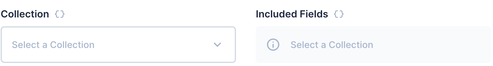
skipUndefinedKeys: ['responseFormat'],The output of these options will look like this:
Prepare the View
Open the panel.vue file and you will see the starter template and script. Skip to the script section and import the following packages:
import { useApi, useCollection, useStores } from '@directus/extensions-sdk';
import { ref, watch } from 'vue';import { useApi, useCollection, useStores } from '@directus/extensions-sdk';
import { ref, watch } from 'vue';In the props, showHeader is one of the built-in properties which you can use to alter your panel if a header is showing. Remove the text property and add the collection and fields properties as well as the width and height which is useful for styling:
props: {
showHeader: {
type: Boolean,
default: false,
},
collection: {
type: String,
default: '',
},
fields: {
type: Array,
default: [],
},
responseFormat: {
type: String,
default: '',
},
width: String,
height: String,
},props: {
showHeader: {
type: Boolean,
default: false,
},
collection: {
type: String,
default: '',
},
fields: {
type: Array,
default: [],
},
responseFormat: {
type: String,
default: '',
},
width: String,
height: String,
},After the props, create a setup(props) section and create the variables needed:
setup(props) {
const { useFieldsStore, usePermissionsStore } = useStores();
const fieldsStore = useFieldsStore();
const permissionsStore = usePermissionsStore();
const hasPermission = permissionsStore.hasPermission(props.collection, 'create');
const api = useApi();
const { primaryKeyField } = useCollection(props.collection);
const formData = ref({});
const fieldData = ref([]);
const formResponse = ref({});
const formError = ref({});
const responseDialog = ref(false);
}setup(props) {
const { useFieldsStore, usePermissionsStore } = useStores();
const fieldsStore = useFieldsStore();
const permissionsStore = usePermissionsStore();
const hasPermission = permissionsStore.hasPermission(props.collection, 'create');
const api = useApi();
const { primaryKeyField } = useCollection(props.collection);
const formData = ref({});
const fieldData = ref([]);
const formResponse = ref({});
const formError = ref({});
const responseDialog = ref(false);
}The FieldsStore fetches all of the collection’s fields, the PermissionsStore checks the current user’s access to the collection, and the Collection store for fetching information about the selected collection and the API for performing the final POST request.
You will also need to capture a response to present to the user. The responseFormat contains a string where the user can create their own response with data from the API. A v-dialog can show an important message to the user. This requires a boolean value (here responseDialog) to control the visibility of the dialog box.
Create a getFields function to fetch the detailed information for each selected field then call the function afterwards so it populates the variable when the panel loads:
function getFields() {
fieldData.value = [];
props.fields.forEach((field) => {
fieldData.value.push(fieldsStore.getField(props.collection, field));
});
}
getFields();function getFields() {
fieldData.value = [];
props.fields.forEach((field) => {
fieldData.value.push(fieldsStore.getField(props.collection, field));
});
}
getFields();If the fields, collection, or response format is changed, the getFields function will need to be called again. Use the following code:
watch([() => props.collection, () => props.fields, () => props.responseFormat], getFields);watch([() => props.collection, () => props.fields, () => props.responseFormat], getFields);Create a submitForm function. This will send the contents of formData to the selected collection and capture the response, resetting the form once successful. If an error occurs, the response is captured in the formError variable:
function submitForm() {
api
.post(`/items/${props.collection}`, formData.value)
.then((response) => {
formResponse.value = response.data.data;
responseDialog.value = true;
formData.value = {};
})
.catch((error) => {
formError.value = error;
responseDialog.value = true;
});
}function submitForm() {
api
.post(`/items/${props.collection}`, formData.value)
.then((response) => {
formResponse.value = response.data.data;
responseDialog.value = true;
formData.value = {};
})
.catch((error) => {
formError.value = error;
responseDialog.value = true;
});
}To show the response, the responseDialog variable is changed to true.
In the successful response, it will be useful to have a link to the new record. Create the following function to build the URL for the newly created item:
function getLinkForItem(item) {
if (item === undefined) return;
const primaryKey = item[primaryKeyField.value.field];
return `/content/${props.collection}/${encodeURIComponent(primaryKey)}`;
}function getLinkForItem(item) {
if (item === undefined) return;
const primaryKey = item[primaryKeyField.value.field];
return `/content/${props.collection}/${encodeURIComponent(primaryKey)}`;
}At the end of the script, return the required constants and functions for use in the Vue template:
return {
hasPermission,
primaryKeyField,
formData,
fieldData,
submitForm,
formResponse,
formError,
responseDialog,
getLinkForItem,
};return {
hasPermission,
primaryKeyField,
formData,
fieldData,
submitForm,
formResponse,
formError,
responseDialog,
getLinkForItem,
};Build the View
Back to the template section, remove all the content between the template tags, then add the following code to handle the permissions:
<template>
<div v-if="!hasPermission" class="panel-error">
<v-notice type="danger" icon="warning">You do not have permissions to {{ collection }}</v-notice>
</div>
<div v-else :class="['panel-internal-form', { small: width < 30, large: width >= 30, 'has-header': showHeader }]">
<!-- Form goes here -->
</div>
</template><template>
<div v-if="!hasPermission" class="panel-error">
<v-notice type="danger" icon="warning">You do not have permissions to {{ collection }}</v-notice>
</div>
<div v-else :class="['panel-internal-form', { small: width < 30, large: width >= 30, 'has-header': showHeader }]">
<!-- Form goes here -->
</div>
</template>To help with small and large panel layouts, add the class small when the width is less than 30, otherwise add the class large. This allows you to use CSS to style the form.
Add the following inside the panel - it will send the fields inside fieldData to the form component. This will render the form and capture the outputs into the formData model. Below that add a button to submit the data to the API.
<v-form v-if="fieldData" :fields="fieldData" v-model="formData" />
<v-button v-if="Object.keys(formData).length > 0" @click="submitForm()">Save</v-button>
<v-button v-else secondary>Save</v-button><v-form v-if="fieldData" :fields="fieldData" v-model="formData" />
<v-button v-if="Object.keys(formData).length > 0" @click="submitForm()">Save</v-button>
<v-button v-else secondary>Save</v-button>Secondary Button
The secondary button shows an inactive button when the form is not ready to submit. Use this conditional for any further validation.
Under the submit button, create the v-dialog component. This uses the responseDialog variable for visibility. Inside the dialog, create some notices for various situations such as Success (primary key field exists), Error (formError has value) and Empty:
<v-dialog v-model="responseDialog" @esc="responseDialog = false">
<v-sheet>
<v-notice type="success" icon="done" v-if="formResponse[primaryKeyField.field]">Saved</v-notice>
<v-notice type="danger" icon="warning" v-else-if="formError">An Error Occurred</v-notice>
<v-notice type="danger" icon="warning" v-else>No Response</v-notice>
<blockquote v-if="formResponse" class="form-response">
<router-link :to="getLinkForItem(formResponse)">
<render-template
:collection="collection"
:template="responseFormat"
:item="formResponse"
/>
<v-icon name="launch" small />
</router-link>
</blockquote>
<blockquote v-else-if="formError" class="">
{{ formError }}
</blockquote>
<v-button @click="responseDialog = false">Done</v-button>
</v-sheet>
</v-dialog><v-dialog v-model="responseDialog" @esc="responseDialog = false">
<v-sheet>
<v-notice type="success" icon="done" v-if="formResponse[primaryKeyField.field]">Saved</v-notice>
<v-notice type="danger" icon="warning" v-else-if="formError">An Error Occurred</v-notice>
<v-notice type="danger" icon="warning" v-else>No Response</v-notice>
<blockquote v-if="formResponse" class="form-response">
<router-link :to="getLinkForItem(formResponse)">
<render-template
:collection="collection"
:template="responseFormat"
:item="formResponse"
/>
<v-icon name="launch" small />
</router-link>
</blockquote>
<blockquote v-else-if="formError" class="">
{{ formError }}
</blockquote>
<v-button @click="responseDialog = false">Done</v-button>
</v-sheet>
</v-dialog>Use a blockquote to output a response using the responseFormat value and the render-template component. When you supply the collection, template, and formResponse to this component, it will replace all placeholder variables.
If the form response is empty, output formError which contains the details of the error.
Use a button at the bottom to dismiss the dialog box. The click function needs to change the responseDialog to false.
Lastly, replace the CSS at the bottom with this:
<style scoped>
.panel-internal-form {
padding: 12px;
}
.panel-internal-form.has-header {
padding: 0 12px;
}
.panel-internal-form.small :deep(.field) {
grid-column: start/fill;
}
.panel-internal-form :deep(.v-form) {
margin-bottom: var(--theme--form--row-gap);
}
.form-response {
border-radius: var(--theme--border-radius);
border: var(--theme--border-width) solid var(--theme--form--field--input--border-color);
margin: 1em 0;
min-width: 300px;
}
.form-response a {
position: relative;
display: block;
padding: var(--theme--form--field--input--padding);
}
.form-response a:hover {
cursor: pointer;
background-color: var(--v-list-item-background-color-hover);
}
.form-response a :deep(.v-icon) {
position: absolute;
right: var(--theme--form--field--input--padding);
top: var(--theme--form--field--input--padding);
}
</style><style scoped>
.panel-internal-form {
padding: 12px;
}
.panel-internal-form.has-header {
padding: 0 12px;
}
.panel-internal-form.small :deep(.field) {
grid-column: start/fill;
}
.panel-internal-form :deep(.v-form) {
margin-bottom: var(--theme--form--row-gap);
}
.form-response {
border-radius: var(--theme--border-radius);
border: var(--theme--border-width) solid var(--theme--form--field--input--border-color);
margin: 1em 0;
min-width: 300px;
}
.form-response a {
position: relative;
display: block;
padding: var(--theme--form--field--input--padding);
}
.form-response a:hover {
cursor: pointer;
background-color: var(--v-list-item-background-color-hover);
}
.form-response a :deep(.v-icon) {
position: absolute;
right: var(--theme--form--field--input--padding);
top: var(--theme--form--field--input--padding);
}
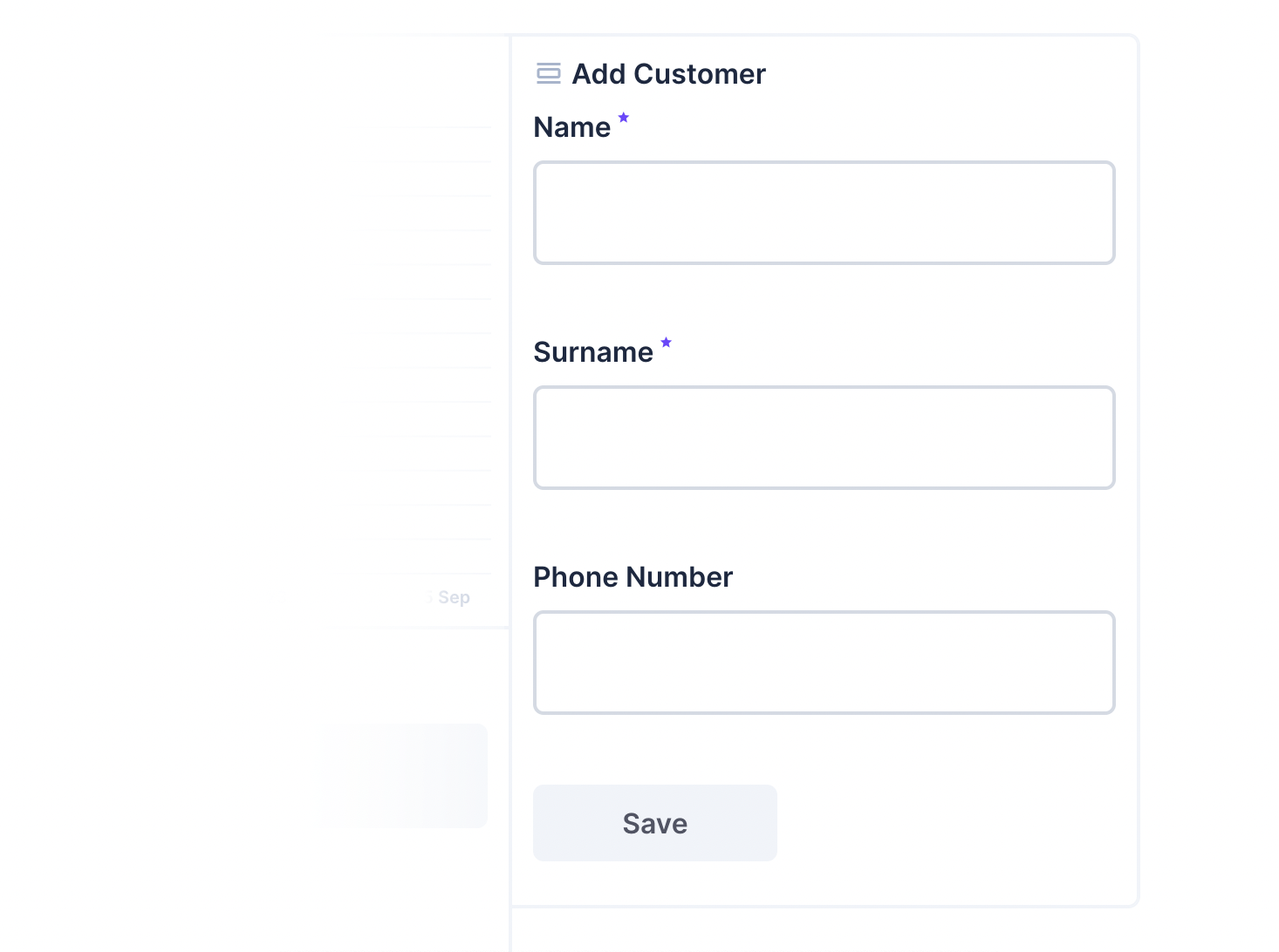
</style>When it's all put together, the panel looks like this:
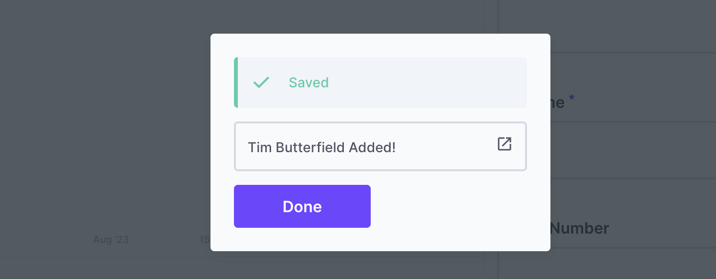
And the response looks like this:
Both files are now complete. Build the panel with the latest changes.
npm run buildnpm run buildAdd Panel to Directus
When Directus starts, it will look in the extensions directory for any subdirectory starting with directus-extension-, and attempt to load them.
To install an extension, copy the entire directory with all source code, the package.json file, and the dist directory into the Directus extensions directory. Make sure the directory with your extension has a name that starts with directus-extension. In this case, you may choose to use directus-extension-panel-internal-form.
Restart Directus to load the extension.
Required files
Only the package.json and dist directory are required inside of your extension directory. However, adding the source code has no negative effect.
Use the Panel
From an Insights dashboard, choose Internal Form from the list.
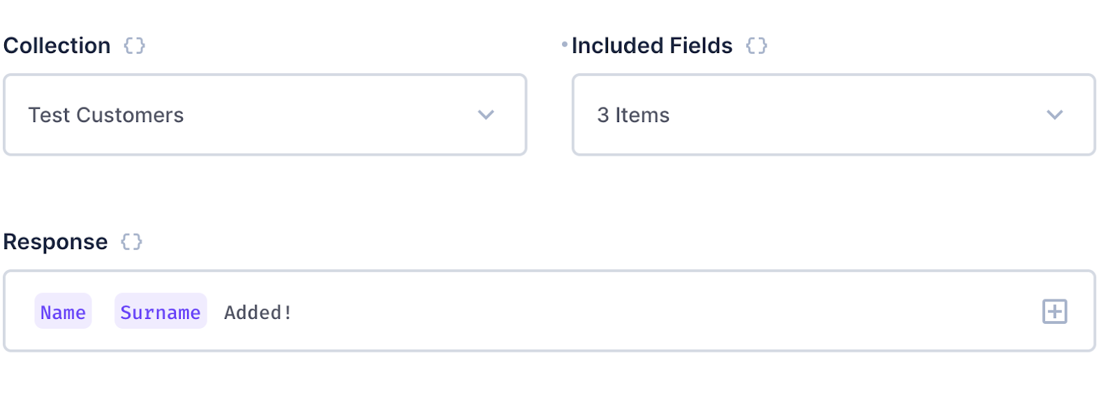
Fill in the configuration fields as needed:
- Choose a collection.
- Select all the fields to include from that collection.
- Create a custom response message.
Summary
With this panel, you can create forms to create items in your collections. You have worked with the FieldsStore and PermissionsStore, and can further expand on this example for other changes to your database.
Complete Code
index.js
import PanelComponent from './panel.vue';
export default {
id: 'panel-internal-form',
name: 'Internal Form',
icon: 'view_day',
description: 'Output a form to insert data into a collection.',
component: PanelComponent,
options: [
{
	field: 'collection',
	type: 'string',
	name: '$t:collection',
	meta: {
		interface: 'system-collection',
		options: {
			includeSystem: true,
			includeSingleton: false,
		},
		width: 'half',
	},
},
{
	field: 'fields',
	type: 'string',
	name: 'Included Fields',
	meta: {
		interface: 'system-field',
		options: {
			collectionField: 'collection',
			multiple: true,
		},
		width: 'half',
	},
},
{
	field: 'responseFormat',
	name: 'Response',
	type: 'string',
	meta: {
		interface: 'system-display-template',
		options: {
			collectionField: 'collection',
			placeholder: '{{ field }}',
		},
		width: 'full',
	},
},
],
minWidth: 12,
minHeight: 8,
skipUndefinedKeys: ['responseFormat'],
};import PanelComponent from './panel.vue';
export default {
id: 'panel-internal-form',
name: 'Internal Form',
icon: 'view_day',
description: 'Output a form to insert data into a collection.',
component: PanelComponent,
options: [
{
	field: 'collection',
	type: 'string',
	name: '$t:collection',
	meta: {
		interface: 'system-collection',
		options: {
			includeSystem: true,
			includeSingleton: false,
		},
		width: 'half',
	},
},
{
	field: 'fields',
	type: 'string',
	name: 'Included Fields',
	meta: {
		interface: 'system-field',
		options: {
			collectionField: 'collection',
			multiple: true,
		},
		width: 'half',
	},
},
{
	field: 'responseFormat',
	name: 'Response',
	type: 'string',
	meta: {
		interface: 'system-display-template',
		options: {
			collectionField: 'collection',
			placeholder: '{{ field }}',
		},
		width: 'full',
	},
},
],
minWidth: 12,
minHeight: 8,
skipUndefinedKeys: ['responseFormat'],
};panel.vue
<template>
<div v-if="!hasPermission" class="panel-error">
<v-notice type="danger" icon="warning">You do not have permissions to {{ collection }}</v-notice>
</div>
<div v-else :class="['panel-internal-form', { small: width < 30, large: width >= 30, 'has-header': showHeader }]">
<!-- Form goes here -->
<v-form v-if="fieldData" v-model="formData" :fields="fieldData" />
<v-button v-if="Object.keys(formData).length > 0" @click="submitForm()">Save</v-button>
<v-button v-else secondary>Save</v-button>
<v-dialog v-model="responseDialog" @esc="responseDialog = false">
<v-sheet>
<v-notice v-if="formResponse[primaryKeyField.field]" type="success" icon="done">Saved</v-notice>
<v-notice v-else-if="formError" type="danger" icon="warning">An Error Occurred</v-notice>
<v-notice v-else type="danger" icon="warning">No Response</v-notice>
<blockquote v-if="formResponse" class="form-response">
<!-- {{ formResponse }} -->
<router-link :to="getLinkForItem(formResponse)">
<render-template :collection="collection" :template="responseFormat" :item="formResponse" />
<v-icon name="launch" small />
</router-link>
</blockquote>
<blockquote v-else-if="formError" class="">
{{ formError }}
</blockquote>
<v-button @click="responseDialog = false">Done</v-button>
</v-sheet>
</v-dialog>
</div>
</template>
<script>
import { useApi, useCollection, useStores } from '@directus/extensions-sdk';
import { ref, watch } from 'vue';
export default {
props: {
showHeader: {
type: Boolean,
default: false,
},
collection: {
type: String,
default: '',
},
fields: {
type: Array,
default: () => [],
},
responseFormat: {
type: String,
default: '',
},
width: String,
height: String,
},
setup(props) {
const { useFieldsStore, usePermissionsStore } = useStores();
const fieldsStore = useFieldsStore();
const permissionsStore = usePermissionsStore();
const hasPermission = permissionsStore.hasPermission(props.collection, 'create');
const api = useApi();
const { primaryKeyField } = useCollection(props.collection);
const formData = ref({});
const fieldData = ref([]);
const formResponse = ref({});
const formError = ref({});
const responseDialog = ref(false);
function getFields() {
fieldData.value = [];
props.fields.forEach((field) => {
fieldData.value.push(fieldsStore.getField(props.collection, field));
});
}
getFields();
function submitForm() {
api
.post(`/items/${props.collection}`, formData.value)
.then((response) => {
formResponse.value = response.data.data;
responseDialog.value = true;
formData.value = {};
})
.catch((error) => {
formError.value = error;
responseDialog.value = true;
});
}
watch([() => props.collection, () => props.fields, () => props.responseFormat], getFields);
return {
hasPermission,
primaryKeyField,
formData,
fieldData,
submitForm,
formResponse,
formError,
responseDialog,
getLinkForItem,
};
function getLinkForItem(item) {
if (item === undefined) return;
const primaryKey = item[primaryKeyField.value.field];
return `/content/${props.collection}/${encodeURIComponent(primaryKey)}`;
}
},
};
</script>
<style scoped>
.panel-internal-form {
padding: 12px;
}
.panel-internal-form.has-header {
padding: 0 12px;
}
.panel-internal-form.small :deep(.field) {
grid-column: start/fill;
}
.panel-internal-form :deep(.v-form) {
margin-bottom: var(--theme--form--row-gap);
}
.form-response {
border-radius: var(--theme--border-radius);
border: var(--theme--border-width) solid var(--theme--form--field--input--border-color);
margin: 1em 0;
min-width: 300px;
}
.form-response a {
position: relative;
display: block;
padding: var(--theme--form--field--input--padding);
}
.form-response a:hover {
cursor: pointer;
background-color: var(--v-list-item-background-color-hover);
}
.form-response a :deep(.v-icon) {
position: absolute;
right: var(--theme--form--field--input--padding);
top: var(--theme--form--field--input--padding);
}
</style><template>
<div v-if="!hasPermission" class="panel-error">
<v-notice type="danger" icon="warning">You do not have permissions to {{ collection }}</v-notice>
</div>
<div v-else :class="['panel-internal-form', { small: width < 30, large: width >= 30, 'has-header': showHeader }]">
<!-- Form goes here -->
<v-form v-if="fieldData" v-model="formData" :fields="fieldData" />
<v-button v-if="Object.keys(formData).length > 0" @click="submitForm()">Save</v-button>
<v-button v-else secondary>Save</v-button>
<v-dialog v-model="responseDialog" @esc="responseDialog = false">
<v-sheet>
<v-notice v-if="formResponse[primaryKeyField.field]" type="success" icon="done">Saved</v-notice>
<v-notice v-else-if="formError" type="danger" icon="warning">An Error Occurred</v-notice>
<v-notice v-else type="danger" icon="warning">No Response</v-notice>
<blockquote v-if="formResponse" class="form-response">
<!-- {{ formResponse }} -->
<router-link :to="getLinkForItem(formResponse)">
<render-template :collection="collection" :template="responseFormat" :item="formResponse" />
<v-icon name="launch" small />
</router-link>
</blockquote>
<blockquote v-else-if="formError" class="">
{{ formError }}
</blockquote>
<v-button @click="responseDialog = false">Done</v-button>
</v-sheet>
</v-dialog>
</div>
</template>
<script>
import { useApi, useCollection, useStores } from '@directus/extensions-sdk';
import { ref, watch } from 'vue';
export default {
props: {
showHeader: {
type: Boolean,
default: false,
},
collection: {
type: String,
default: '',
},
fields: {
type: Array,
default: () => [],
},
responseFormat: {
type: String,
default: '',
},
width: String,
height: String,
},
setup(props) {
const { useFieldsStore, usePermissionsStore } = useStores();
const fieldsStore = useFieldsStore();
const permissionsStore = usePermissionsStore();
const hasPermission = permissionsStore.hasPermission(props.collection, 'create');
const api = useApi();
const { primaryKeyField } = useCollection(props.collection);
const formData = ref({});
const fieldData = ref([]);
const formResponse = ref({});
const formError = ref({});
const responseDialog = ref(false);
function getFields() {
	fieldData.value = [];

	props.fields.forEach((field) => {
		fieldData.value.push(fieldsStore.getField(props.collection, field));
	});
}

getFields();
function submitForm() {
	api
		.post(`/items/${props.collection}`, formData.value)
		.then((response) => {
			formResponse.value = response.data.data;
			responseDialog.value = true;
			formData.value = {};
		})
		.catch((error) => {
			formError.value = error;
			responseDialog.value = true;
		});
}
watch([() => props.collection, () => props.fields, () => props.responseFormat], getFields);
return {
hasPermission,
primaryKeyField,
formData,
fieldData,
submitForm,
formResponse,
formError,
responseDialog,
getLinkForItem,
};
function getLinkForItem(item) {
	if (item === undefined) return;
	const primaryKey = item[primaryKeyField.value.field];
	return `/content/${props.collection}/${encodeURIComponent(primaryKey)}`;
}
},
};
</script>
<style scoped>
.panel-internal-form {
	padding: 12px;
}
.panel-internal-form.has-header {
	padding: 0 12px;
}
.panel-internal-form.small :deep(.field) {
	grid-column: start/fill;
}
.panel-internal-form :deep(.v-form) {
	margin-bottom: var(--theme--form--row-gap);
}
.form-response {
	border-radius: var(--theme--border-radius);
	border: var(--theme--border-width) solid var(--theme--form--field--input--border-color);
	margin: 1em 0;
	min-width: 300px;
}
.form-response a {
	position: relative;
	display: block;
	padding: var(--theme--form--field--input--padding);
}
.form-response a:hover {
	cursor: pointer;
	background-color: var(--v-list-item-background-color-hover);
}
.form-response a :deep(.v-icon) {
	position: absolute;
	right: var(--theme--form--field--input--padding);
	top: var(--theme--form--field--input--padding);
}
</style>