Presentation
Interfaces are how users interact with fields on the Item Detail page. These are the standard Presentation interfaces.
Divider

A horizontal divider to separate fields into different sections.
- Title: Enter a title, or leave blank to only show the divider line.
- Color: Color of the divider.
- Icon: Icon to display.
- Inline Title: Show title inside the divider line or above the line.
Button Links

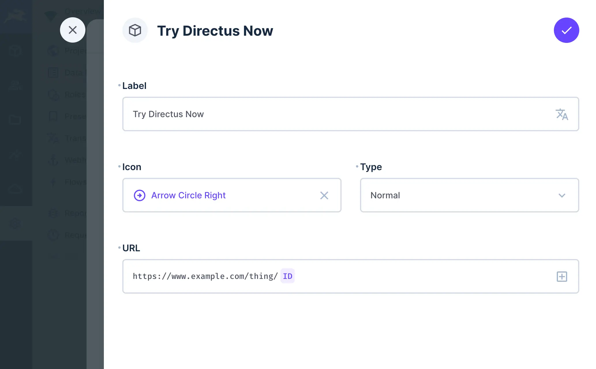
Group of one or more buttons that link to a preset or dynamic url.
- Links: The group of button links.
- Label: Label for the button.
- Icon: Icon displayed beside the button label.
- Type:
Primary,Normal,Info,Success,Warning,Danger - URL: URL to send the user to when the button is clicked. You can use field values from the Item to create the URL dynamically.
Notice

An alert or notice interface to notify users of important information.
- Color:
Primary,Normal,Info,Success,Warning,Danger - Icon: Icon to display in the Notice.
- Text: Enter your notice content. You can also use Translation Strings here to provide notices in different languages.